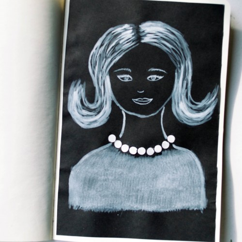
The idea for this portrait came to me when I was looking at a packaging of soap - it was very glossy and it looked like it could look like pearls. As well as the soap packaging, I used white ink mixed with acrylic paint (for opacity) on black paper.
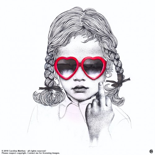
India ink on tissue paper. I had never used ink on this kind of paper before; I really liked the results! There are some folds and wrinkles on the paper that give the pattern some interesting details. The paper is also super absorbing, which plays nicely with the quantities of ink. Since it's very thin, there can easily be overlays between textures. And finally, when trying to use less ink (so that it wouldn't seep through and cause a big dot - the absorbing quality is nice, but it was also somewhat of a challenge!) I used very little ink on the lettering, causing a scratchy, dry look.
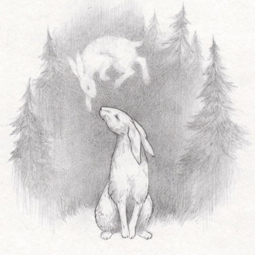
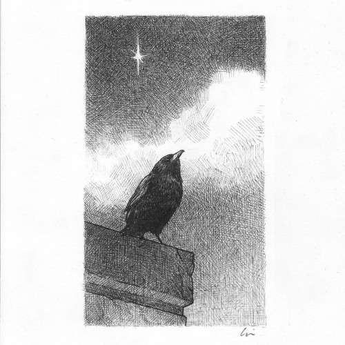
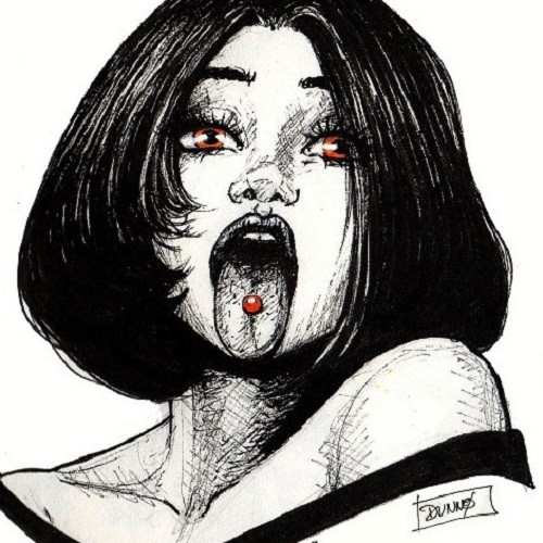
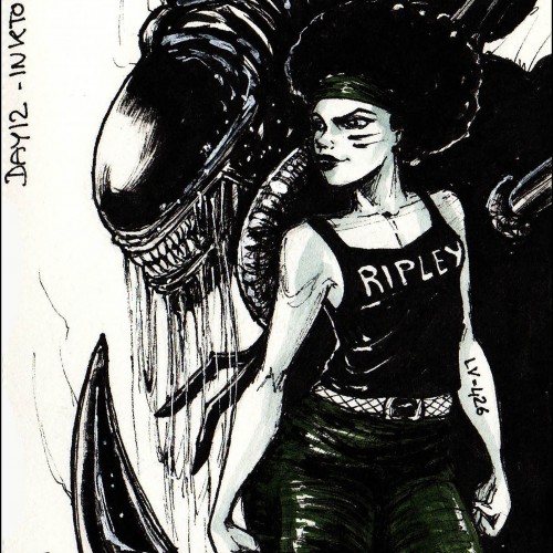
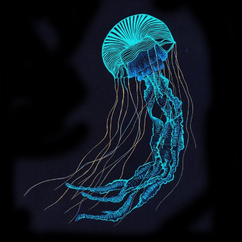
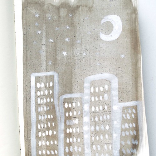
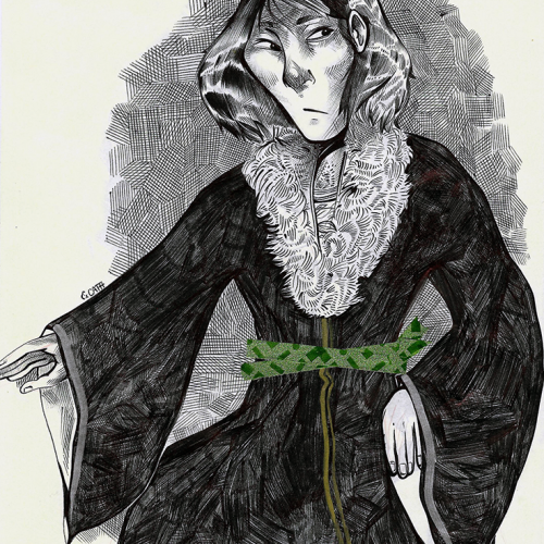
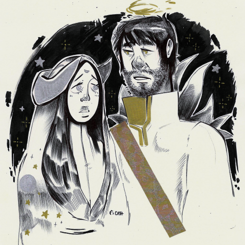
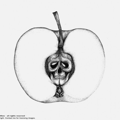
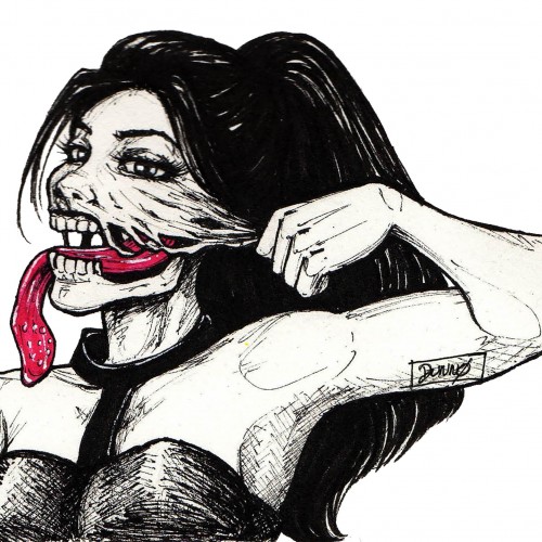
These are my drawings for Inktober 2018. I had set these rules for myself; Making a drawing every day with a dip pen within 15 minutes. Some succeeded, others failed completely, but I enjoyed the challenge!
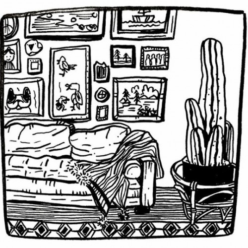
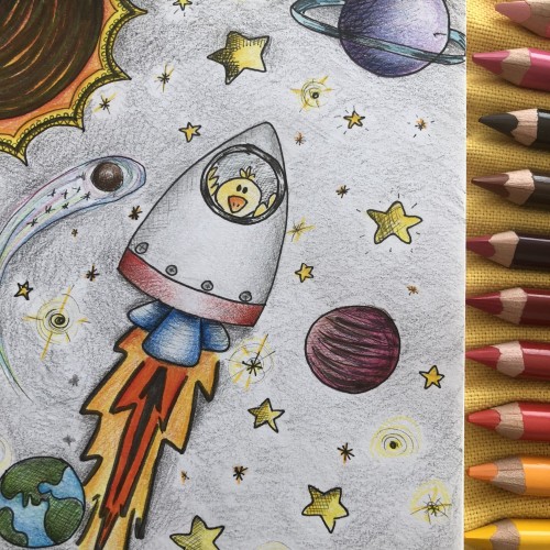
So, I really wasn't going to participate in inktober this year because of time constraints. But I saw some simple line art stuff from others that looked fun. I'll see how far I can make it this year.